03
A campaign that moves with the city.
campaign creative, motion, illustration
Bee Network
Bee Network
The challenge
As part of a pitch for Transport for Greater Manchester, I was tasked with responding to a campaign brief for the Bee Network. The opportunity was not only to demonstrate creative thinking, but to show a clear understanding of an already well-established brand and how it could evolve. Working closely with colleagues to define the brief and shape the messaging, I led the design response and developed two distinct creative routes that balance brand familiarity with fresh impact.
At the heart of the challenge was a behavioural shift, encouraging greater use of public transport. Rather than leaning on abstract messaging, we grounded the campaign in tangible benefits such as flexibility, affordability, convenience, accessibility and sustainability. These were brought together under a single unifying idea: 'Travel your way'. The concept champions personal choice and positions the Bee Network as a system that fits around people’s lives.

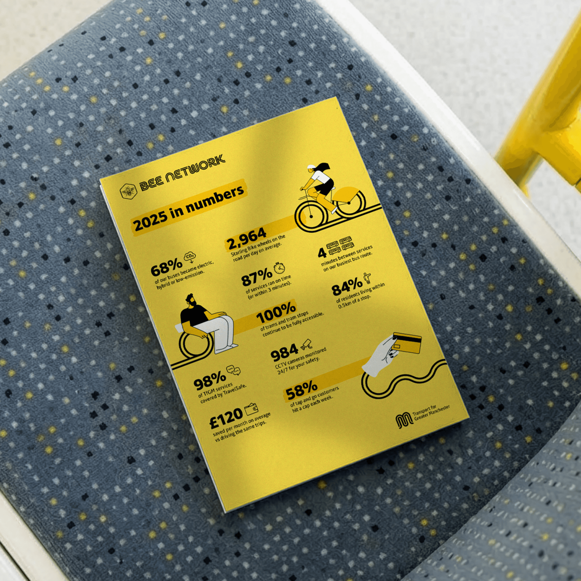


I chose to lead with an illustrative route that pushes the brand into a more expressive space. Existing communications often rely on photography, which can fade into the background in busy environments. This direction introduces a bold, graphic language designed to cut through while still feeling aligned with the brand. A system of flowing double lines runs throughout the work, flexing across different modes of transport and weaving through each composition. They act as a visual metaphor for connection across Greater Manchester, while echoing the character of the brand’s typeface and the TfGM m-blem icon. The result is a simple but distinctive device that creates movement, ties the campaign together and gives it a recognisable sense of rhythm.
Each execution is deliberately focused, with a clear message. Headlines and subheadings follow a consistent structure across formats, helping the campaign feel cohesive whether seen on a poster or within social media. Multiple transport types are featured throughout, reinforcing the scale of the network and the flexibility it offers.


I chose to lead with an illustrative route that pushes the brand into a more expressive space. Existing communications often rely on photography, which can fade into the background in busy environments. This direction introduces a bold, graphic language designed to cut through while still feeling aligned with the brand. A system of flowing double lines runs throughout the work, flexing across different modes of transport and weaving through each composition. They act as a visual metaphor for connection across Greater Manchester, while echoing the character of the brand’s typeface and the TfGM m-blem icon. The result is a simple but distinctive device that creates movement, ties the campaign together and gives it a recognisable sense of rhythm.
Each execution is deliberately focused, with a clear message. Headlines and subheadings follow a consistent structure across formats, helping the campaign feel cohesive whether seen on a poster or within social media. Multiple transport types are featured throughout, reinforcing the scale of the network and the flexibility it offers.
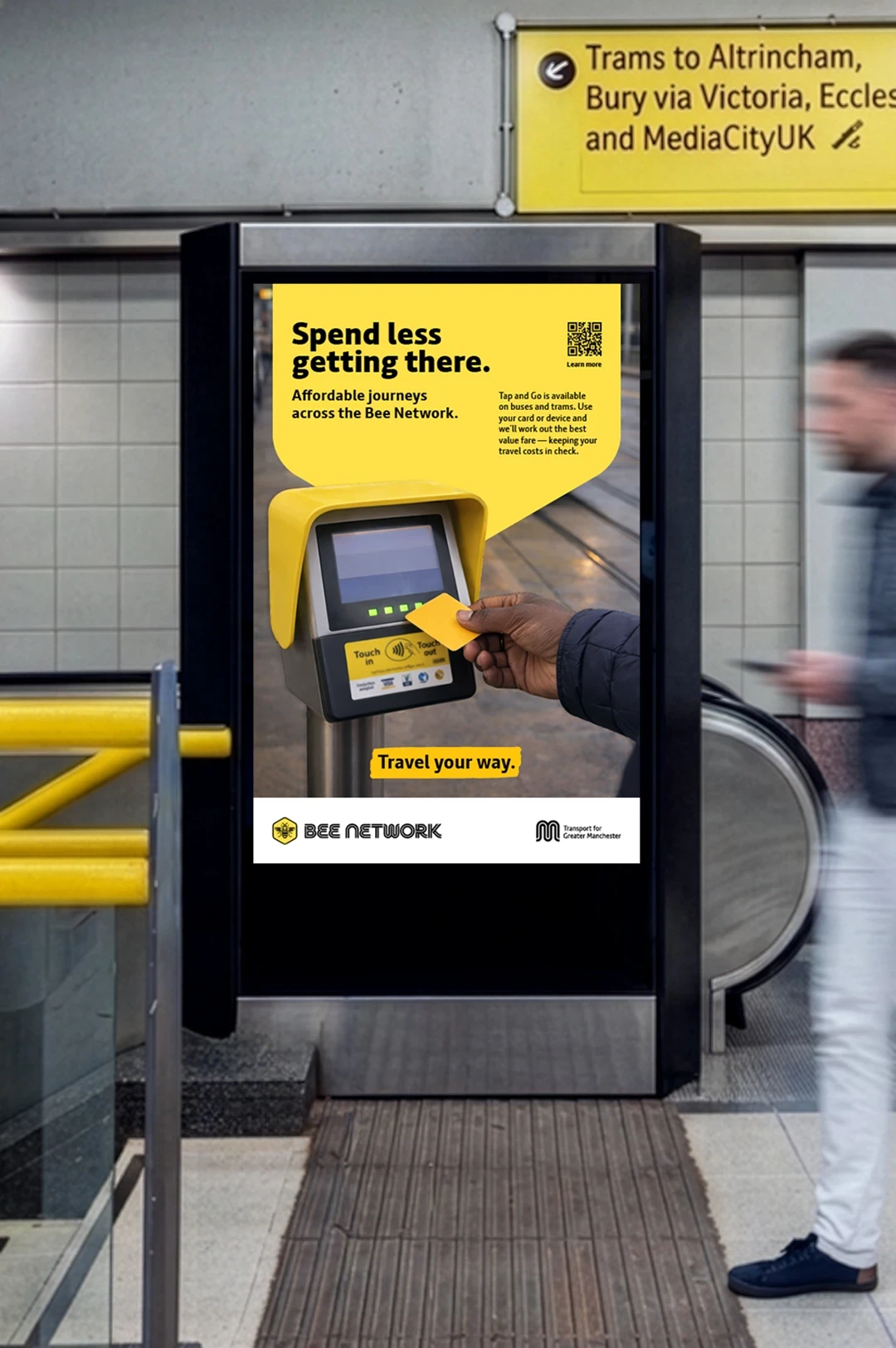
Alongside this, I developed a second, more traditional photographic route aligned closely with the brand’s people-first approach. Authentic moments of passengers using the Bee Network bring relatability and warmth, supported by a consistent hexagonal device that frames messaging across formats. This route demonstrates how the campaign can sit comfortably within current brand expectations while still delivering clarity and impact.
Designed as a campaign rather than a collection of individual executions, the identity is able to flex across formats and channels with ease. From large-scale outdoor placements to social and digital applications, the system maintains clarity and consistency while adapting to different contexts. The result is a recognisable and scalable approach that gives the Bee Network a confident voice, one that can evolve over time while remaining simple, accessible and rooted in everyday journeys.
I chose to lead with an illustrative route that pushes the brand into a more expressive space. Existing communications often rely on photography, which can fade into the background in busy environments. This direction introduces a bold, graphic language designed to cut through while still feeling aligned with the brand. A system of flowing double lines runs throughout the work, flexing across different modes of transport and weaving through each composition. They act as a visual metaphor for connection across Greater Manchester, while echoing the character of the brand’s typeface and the TfGM m-blem icon. The result is a simple but distinctive device that creates movement, ties the campaign together and gives it a recognisable sense of rhythm.
Each execution is deliberately focused, with a clear message. Headlines and subheadings follow a consistent structure across formats, helping the campaign feel cohesive whether seen on a poster or within social media. Multiple transport types are featured throughout, reinforcing the scale of the network and the flexibility it offers.
Alongside this, I developed a second, more traditional photographic route aligned closely with the brand’s people-first approach. Authentic moments of passengers using the Bee Network bring relatability and warmth, supported by a consistent hexagonal device that frames messaging across formats. This route demonstrates how the campaign can sit comfortably within current brand expectations while still delivering clarity and impact.
Designed as a campaign rather than a collection of individual executions, the identity is able to flex across formats and channels with ease. From large-scale outdoor placements to social and digital applications, the system maintains clarity and consistency while adapting to different contexts. The result is a recognisable and scalable approach that gives the Bee Network a confident voice, one that can evolve over time while remaining simple, accessible and rooted in everyday journeys.
Alongside this, I developed a second, more traditional photographic route aligned closely with the brand’s people-first approach. Authentic moments of passengers using the Bee Network bring relatability and warmth, supported by a consistent hexagonal device that frames messaging across formats. This route demonstrates how the campaign can sit comfortably within current brand expectations while still delivering clarity and impact.
Designed as a campaign rather than a collection of individual executions, the identity is able to flex across formats and channels with ease. From large-scale outdoor placements to social and digital applications, the system maintains clarity and consistency while adapting to different contexts. The result is a recognisable and scalable approach that gives the Bee Network a confident voice, one that can evolve over time while remaining simple, accessible and rooted in everyday journeys.
Photography
TfGM
Let's work together
© 2026 Molly Kincaid
Let's work together
© 2026 Molly Kincaid